
This document contains general information, reference information and examples designed to help the user understand the moodss application.
Quite often, one needs to monitor changing data, whether it comes from a system, such as the different processes running on a UNIX server, or from a network, such as the volume and distribution of traffic that runs through it.
Most often, such data can be organized in a table with rows of information, each column representing a different kind of data. For example, in the case of processes running on a computer system, rows might be sorted according to their unique process identifier, with columns containing values such as CPU usage, memory usage, owner's name, time of creation, ...
The software used to view this type of information comes in different forms and shapes. UNIX users might be familiar with the top application which presents rows of process data as lines of text, whereas RMON (Remote MONitoring) SNMP software usually uses multiple windows with graphical displays, curves, pie charts, multiple configuration dialog boxes, even 3D visualization modules to visualize network traffic, connection matrices, ...
In most cases, data comes from one or more tables. A common interface, graphical with menus, drag'n'drop capability, table widgets, textual and graphical data viewers such as multiple line graphs, bar and pie charts, could be used. The user could then sort table rows, select one or more cells, rows, columns, create views such as other tables, charts, ... best suited to the way data should be presented. Once optimized, the data viewers layout and configuration could be saved for later reuse as a dashboard. In effect, what is needed is a spreadsheet tailored to dynamic data processing.
Moodss (Modular Object Oriented Dynamic SpreadSheet) is an attempt at filling these needs. It is composed of a main part (the core) and an unlimited number of modules, loaded as the application is launched or while it is running, each module interfacing to a specific type of data. The core is written in the Tcl language (at www.tcl.tk) using object oriented techniques. The module function is to describe the data that it is also in charge of retrieving and formatting. Modules can be written in a scripting language (Tcl, Perl or Python) or use dynamically linked libraries written in the C language (modules are packages in the Tcl sense, so any language that can interface with Tcl is supported).
Main features:
Modules are loaded when moodss is started or dynamically at a later time, and can be unloaded at any time. Any number of modules can be handled concurrently. This way, you may monitor data coming from any number of heterogeneous sources.
Since module data access is entirely customizable (through C code, Perl, Python, Tcl, HTTP, ...) and since several modules can be loaded at once, applications for moodss become limitless. For example, comparing a remote database server CPU activity and traffic load from a network probe on the same graph becomes possible.
As features are added to moodss, different ways of viewing data will be made available while the module structure will stay the same. The goal of moodss is to become a nice feature packed generic way of monitoring any device. Moodss can be used to monitor any type of data, since the simplest cases can fit in one table with a single row, with the most complicated requiring loading several multiple table modules.
As moodss is written in Tcl and uses well supported extensions (Tktable and BLT), it will run on Tcl/Tk supported platforms: UNIX type, Windows (with less features, such as the moomps daemon) and Apple OS X. Obviously, some modules may be specific to a platform, but the core is guaranteed to run on them all.
After reading and understanding this document, you should be able to build your own dashboards in order to monitor the data that you are interested in.
Moodss is free software. You can redistribute it and modify it under the terms described in the COPYRIGHT file.
For a quick, hassle-free try, if you are using a Linux system, download and install the standalone 32 bit or 64 bit binary, complete with all required software, which installs in a sub-directory:
$ tar -xjf moodss-21.5.i386.tar.bz2       # unpack it
$ moodss-21.5/moodss.sh cpustats memstats # now use it
$ rm -rf moodss-21.5/                     # remove it
For a permanent installation, if you are using a Linux Red Hat or Fedora system (7.0 or above), then use the moodss rpm file (available at moodss.sourceforge.net) for installation. It requires the tcl, tk, blt, tktable and sqlite rpms also referenced at the same location.
In any case, for UNIX type platforms, read the INSTALL file, included in the distribution tarball.
For Windows platforms, read the install.txt file, included in the zip distribution.
For the current version (21.5), the following packages must be installed before attempting to install moodss:
If you want to use the optional database archiving and history browsing features, one or more of the following packages can be used:
If you want to use the predictor tool (to predict the future behavior of data from database history), the following package must be installed:
The XML, DOM, BWidget, pie widgets, stooop and scwoop libraries are included in the self contained moodss application file. Therefore, it is not required to install the tclXML, tclDOM, BWidget, stooop, scwoop and tkpiechart packages, unless you want to work on the moodss source code itself. However, should you want to get more information on those extensions, you will find the latest versions:
Finally, if you want to develop your own modules in a language other than Tcl, such as Perl or Python, you will need:
The moodss application is composed of the core software and one or several modules.
The core loads one or more modules, whose names are passed as command line parameters, come from a dashboard file or are dynamically loaded, and starts displaying module data in one or more tables. The tables are then updated at the frequency defined by the poll time, which the user may change, or asynchronously for the relevant modules. For example, to launch moodss with the random module, just type (on a UNIX machine):
$ moodss random |
The initial data tables represent the first data views, from which any number of cells can be selected. Data viewers can be created by dragging and dropping cells into a graph, bar chart, pie chart, statistics and values tables, free text or thresholds sites. In turn, these viewers can display more table cells, which when dropped into the viewer, result in the creation of corresponding data graph lines, chart bars, pie slices, table rows or text cells. Cells or rows can be removed from existing viewers, by simply selecting them and dropping them in the eraser iconic site (in the shape of a pencil eraser).
Formulas tables are a special kind of viewer. They are created from the Edit/New viewer menu and a specific dialog box. Once created though, they behave as other viewers, and allow dragging formula cells (the result of the formula represented as a single value) into any other viewer or drop site.
Any viewer can be mutated (its type changed) by dragging from a viewer icon and dropping into it. For example, create a stacked data bar viewer from several cells, then drag the 3D pie icon into it. Any viewer can also be destroyed in one shot by dropping the eraser icon into it.
Any draggable data can be dropped in any valid drop site at any time. It is thus possible to drag several data cells from any table or any viewer into other ones, the thresholds interface, the eraser, ... even if the data comes from different modules.
All data viewers can be moved and resized at will with the help of a simple internal window manager.
The current configuration (existing pages, loaded modules, tables and viewers coordinates, sizes, poll time, main window size, ...), whether in real time mode or database mode, can be saved in a file at any time, so that an identical dashboard can be relaunched at will.
Note that all configuration and preferences data is written to disk in XML 1.0 format, to follow standards, and so it is possible to edit (carefully) using a plain text or specialized editor.
Immediately after launch, module(s) is(are) loaded and initialized, with corresponding messages displayed in the message area, as follows:
Soon after, tabular data is displayed in one or more tables, between the menu bar, the tool bar, the drop sites with graphical viewers, statistics and values tables, free text, thresholds and eraser icons, pages tabs and a message area, as one can see below:
If there are several pages (views), notebook tabs appear below the canvas area (see above).
The message area is used to display status information, such as when the data is being updated, and help information, as the user moves the mouse pointer over sensitive areas, such as table column headers. Contextual help on all menu items is also activated as traversal occurs, either using the mouse or the keyboard, resulting in a short explicative string appearing in the message area and related to the active (highlighted) menu item. Further help is provided through widget tips (also known as balloons) when appropriate (on data table column headers, for example), and of course the Help menu.
The message area header label also serves as a thresholds indicator for all the thresholds activated in the application. The label takes the color of the most important active threshold (according to its importance level). If there are several active thresholds of the same most important level, but with different colors, then the colors are shown in sequence, 1 per second. A widget tip also shows the most important thresholds summaries (also see pages and message).
The window title shows the name of the loaded module(s) along with the poll time, if not in database mode.
Various thresholds can also be set on any data cells, as documented in the thresholds section.
Tables contain module data and feature the module identifier as title. Scroll bars are displayed when data is not wholly visible.
When several modules of the same type are loaded (for example, CPU statistics on a group of servers), the initial data tables feature the module name followed by an instance number (module<N>), or the module identifier generated from the module code (cpustats(host.domain.org) for example). A lone module keeps his unmodified name as table titles.
Note that the title bar changes color to reflect the state of the corresponding module:
Any data displayed in a table can be sorted (provided that the related module allows it) at any time by simply clicking on a column title. Clicking on the same column title again sorts the data in the opposite order, thus toggling between increasing and decreasing orders.
When sorting, the selected column is used as a reference, meaning that all rows will be rearranged so that the selected column appears sorted, with values either increasing or decreasing.
A little triangular indicator is placed to the right of the reference column title label, pointing up or down depending on whether the sorting order is decreasing or increasing.
If the module allows it (most modules use automatic column sizing), table columns can be interactively resized by holding the first mouse button down on a column border. The mouse cursor is changed to an horizontal double arrow on column borders to show this capability.
Sometimes, data does not completely fit in the cells of the rightmost column of a displayed data table. For example, this often happens when using the log module, where some messages in a UNIX log spool can be very long. In such cases, when the text of the data cell is clipped, moving the mouse cursor over that cell results in a widget tip (balloon), containing the whole cell data, being displayed next to the cell.
Aside from the main tables, graphical and textual viewers can be created for monitoring table cells in real time or deferred time, when in database mode. Viewers can be deleted, data elements (such as pie slices, curves, ...) can be added or removed from existing viewers, ... These functions are all implemented using drag and drop.
For all viewers, if a module identifier string is required (provided by the module, several instances of the same module, ...) for proper cell identification, that string will be placed first in the label. For example, data cells originating from the third instance of the random module would be labeled: "random<3>: data cell label".
For graphical viewers (graphs, bars and pies), it is possible to change the displayed color of the graphical element (curve, bar or slice) used to display the cell data, by clicking with the mouse button 3 on the data cell label. A popup menu is then displayed, containing a set of color choices corresponding to the current viewers colors configuration.
Picking a color instantaneously changes the color of the displayed element. Such user defined colors are saved in the configuration file and properly restored.
Graph viewers display the history of one or more data cells over some period of time (depending on the poll time and the number of samples, set in configuration). In the simple graph viewer, cells data is displayed as curves of different colors, whereas in the stacked graph case, values for each data cell are added to each other and the areas below the curves filled with color (see images below).
When displaying database history data, the graph viewers display all data samples for the selected time range (see database section).
Graph viewers feature an automatic cross hair which follows the mouse pointer movements inside the plotting area. Corresponding coordinates are displayed in the main window message area.
 |
 |
It is possible to set the Y axis (ordinate) maximum value, and also minimum value in the case of the simple graph viewer. These limits can either be fixed or dynamically follow the value of any data cell.
To set a fixed value, click with the mouse button 3 on any part of the viewer to display a popup menu. After selection of the limit type (minimum or maximum), a limit entry zone is created in the upper left corner of the viewer for a maximum value (see pictures above), or in the lower left corner of the plot area for a minimum value.
Just type in the new value, or an empty string if you want to remove the limit value and to restore the default behavior.
By default, the Y axis of a graph automatically scales based on the displayed data values.
Once the limit entry is visible, use the Enter key to validate your choice or the Escape key to cancel the operation.
A small red arrow next to the limit value is used as an indicator that the limit value has been set (see pictures above).
Note that in the case of the fixed minimum, the default for all simple graph viewers can be set to 0 in the dashboard configuration or preferences dialog boxes.
To set a dynamic value, drop any data cell in the upper left corner of the viewer for a maximum value, or in the lower left corner of the plot area for a minimum value. The drop area then materializes a small rectangle with black borders. Drop the data cell and from then on, its value is used as the dynamic limit of the viewer.
To change the dynamic value, you may drop another data cell as a replacement, or change to a fixed value as described above, or delete the dynamic limit data cell by entering an empty fixed value.
If the minimum and maximum limits are incompatible (with for example the minimum value being greater than the maximum value), both limit values are displayed in red, and the limits remain as previously available.
When placing the mouse cursor in the upper or lower left corner of the viewer, a help tip is displayed showing the current state of the limit for the viewer (either none set, fixed value set or dynamic value with the name of the data cell used).
Also available in the popup menu is the ability to choose the position of labels of data cells, from the Labels sub-menu. The available positions are Right, Bottom, Left and Top, all relative to the graphical part of the viewer.
The default position can be set from the configuration or preferences dialog boxes.
It is possible, from the popup menu, to toggle the display of a grid in the plot area, with the default state being set from the configuration or preferences dialog boxes, where it is also possible to choose a background color for the plot area, or set the angle of the X axis labels (from 45 degrees to the default 90 degrees).
Bar chart viewers available at this time are side-by-side bars charts, overlapped bars charts and stacked bars charts. In the stacked bars charts case, cells data values are added to each other, whereas in the others, they are displayed next to each other, overlapping or not (see pictures below).
When displaying database history data, the bar chart viewers display the values at the time selected by the right side cursor in the database module instances viewer (see database section).
 |
 |
 |
Just as in the graph viewers, it is possible to set the Y axis (ordinate) maximum and minimum (except in the stacked bars chart case) value and the position of the labels of data cells.
Pie viewers come in 2 types: 2D or 3D. The data cells values can either be placed around the pie area or next to the labels (see configuration).
In database browsing mode, dynamic values take the values at the latest of the 2 times defined by the cursors (see the database range section).
 |
 |
It is possible to fix the total value (corresponding to 100 % of the pie). This limit can either be fixed or dynamically follow the value of any data cell.
To set a fixed value, click with the mouse button 3 on any part of the viewer to display a popup menu. After selection, an entry zone is created in the upper left corner of the viewer (see pictures above).
Just type in the new value, or an empty string if you want to remove the total value and to restore the default behavior.
By default, the slices of a pie automatically scales based on the displayed data values, so that their total always match 100 %.
Once the total entry is visible, use the Enter key to validate your choice or the Escape key to cancel the operation.
A small red arrow next to the total value is used as an indicator that the total value has been set (see pictures above).
To set a dynamic value, drop any data cell in the upper left corner of the viewer. The drop area then materializes a small rectangle with black borders. Drop the data cell and from then on, its value is used as the dynamic total of the viewer.
To change the dynamic value, you may drop another data cell as a replacement, or change to a fixed value as described above, or delete the dynamic limit data cell by entering an empty fixed value.
When placing the mouse cursor in the upper left corner of the viewer, a help tip is displayed showing the current state of the limit for the viewer (either none set, fixed value set or dynamic value with the name of the data cell used).
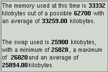
The statistics table displays, for each row, the cell label, the current, average, minimum, maximum and standard deviation values, either since the row was created in real-time mode, or over the period delimited by the 2 times defined by the cursors in database mode. (see the database range section).
Note: the standard deviation characterizes the degree of variance of the data (the standard deviation is defined as the square root of the variance).
Data cells can be inserted one or several at a time through a simple drop. Rows can be deleted by selecting any cell in the row then dropping any number of them into the eraser drop site. Data cells with missing data (could be no longer available if coming from a vanished process, for example) display the ? character. When displaying database history data, the average, minimum, maximum and standard deviation values are calculated for the selected time range.
 |
 |
The values table displays for each row the cell label and the current values of the cell data. It behaves exactly as the statistics table, but without the average, minimum, maximum and standard deviation columns. It can be used in dashboards to display cells that are hidden when the corresponding module tables are iconified.
In database browsing mode, the values table behaves differently: it displays the history of the dropped data cell (there can be only one), which is all the values archived for that data cell within the database time range. The number or displayed rows is limited (see tables configuration). If the data is so truncated, an initial blank row is displayed as an indicator:
Formulas tables are described in the formulas section.
The free text viewer is an editable Tk text widget with any number (including zero) of embedded data cell windows. Data cells can be inserted one or several at a time through a simple drop, as with the other viewers. New data cell windows are inserted at the current insertion cursor position. Data cells can be deleted by selecting then dropping any number of them into the eraser drop site. They can also be deleted using the keyboard Delete and Backspace keys, which also work on the regular text, as well as the expected other key bindings. When dropping data cells, each data cell window is preceded by a relevant label text for the cell, which can later be edited at any time.
 |
When displaying database history data, the displayed values are at the time selected by the right side cursor in the database module instances viewer (see database section).
You may change the text size and the background color via a popup menu. Additionally, the text size can be increased and decreased using the Control-plus and Control-minus key sequences.
An iconic viewer is an icon associated with a single data cell, the label and the value of which are displayed underneath the icon, a graphical image in the GIF format, chosen the by user at creation time, and later optionally changed using a popup menu traditionally activated by mouse button 3.
The background color may change according to the thresholds set on the data cell. For example, as shown in the following screen shot, a threshold was set on the hard disk drive temperature, with an orange color when the temperature goes over 40 degrees Celsius.
 |
Note that, due to the internal implementation, iconic viewers always appear below ant other objects in the work area, such as tables and other viewers. Consequently, when a new iconic viewer is created, it may be hidden by other objects in the upper left corner of the window. However, a black rectangle, of the size of the new viewer, flashes for a brief moment to help spot the location of the new viewer.
An iconic viewer otherwise behaves as other viewers, and may be dragged and dropped, as well as mutated. When it is dropped in another viewer, it snaps back to its original location, once the drop operation is complete. Also note that it is impossible to drop an iconic viewer into another iconic viewer.
Formulas are mathematical expressions that include data cells from any module, and even other formulas tables. For example, the memory usage of a computer in percent can be obtained by dividing the used memory by the available memory and multiplying the result by 100.
Formulas are organized in tables, created via the Edit/New viewer menu, which triggers the display of the formulas dialog box, also used for editing existing formulas from a formulas table (see editing below).
Note: use the formulas documentation for a complete reference on expressions.
The formulas dialog box (see screen shot below) allows the user to name, document, create and test formulas made from a mathematical expression and several data cells from any loaded module.
The dialog box is displayed at the time the user decides to create a new formulas table, via the Edit/New viewer menu, or via a popup menu in an existing formulas table.
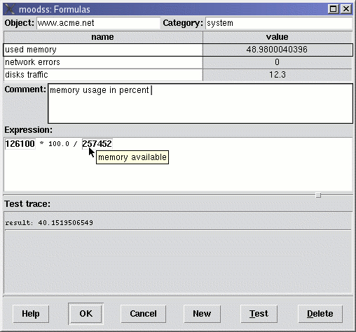
Starting from the top, when a formulas table is first created, the user should enter at least the Object that the formulas relate to (for example, a computer name, a network service such as a web site, a database, ...) and possibly the Category of the formulas (system, statistics, errors, network, ...).
These 2 important pieces of information should be as short as possible, and carefully named, as they are used in the title of formulas tables, formulas tables data cells identifiers, and as keywords for archiving formulas results in a database.
These 2 fields are no longer editable once the formulas table has been created (by validating the contents of the dialog box).
Note: you can however create another formulas table with modified object and category fields, and transfer the existing formulas to this new table, by drag and drop.
To create a formula, press the New button. A new entry is created in the formulas list and is automatically selected.
Fill in the name of the formula. Carefully choose it as short as possible while remaining meaningful. It is used as the name of the data cell of the result of the formula, which you will be able to drag and drop into viewers, for example (see formulas tables section below).
Note: the result, or value, or the formula is displayed as ? for now, until the expression of the formula is input and eventually tested.
Once the name is determined, you can enter help or comments on the new formula in the Comment section below the current list of formulas. This information will be displayed as a widget tip (or help balloon) when the mouse cursor is left over the formula name in the formulas table (see formulas table screen shot below). You may format the text to your liking and use several lines. This help text can be changed at any time once the formula has been created.
It is now time to create the most important part of the formula: its actual mathematical expression. Go ahead and type 1 + 2 in the Expression input area, press the Test button at the bottom of the dialog box: the result (3) should appear in the Test trace area below the expression.
The test trace reports valid results as well as error messages as appropriate.
Now erase the expression using the <Backspace> or <Delete> keys as you would normally do in a common text editor. Now drag a data cell from any displayed module table in the main application window and drop it into the expression area, hit the test button: the current value of the data cell should appear as the result of the formula in the test trace.
You may now combine any number of data cells, constant numbers, mathematical operators and functions in real formulas. You may, and should, use the test feature as many times as required until you are satisfied with the results of the expression.
For all data cells composing an expression, moving the mouse cursor over a cell displays a widget tip bearing the data cell label (see screen shot above), allowing the user to check the components of a formula at any time.
Once all the formulas have been created, press OK: a formulas table appears in the main window. You may edit the formulas, add new formulas or delete existing ones at any time by using a popup menu in the formulas table, which will result in the formulas dialog box to be displayed.
A table of formulas displays the names and values of expressions of a list of formulas, belonging to an object and possibly a category for that object (see formulas editing section above).

A formulas table is a viewer, albeit with a title (bearing the object and the category if any), which makes it an exception among the viewers.
Note: it is also an exception in the sense that each formulas table is associated with an internal formulas module instance, which you may find hints of when recording formulas data cells history in a database and then browsing the database.
Note that, contrary to a module table, the title bar of a formulas table never changes color.
In the value column, you will find data cells that show the result of the corresponding formulas (result of expressions actually). Each value is updated every time any of its contained data cell is updated. For example, if a formula contains cells from the netdev module and cells from the diskstats module, the value of the formula will be updated if either of the netdev and diskstats module data is updated. Generally speaking, the formulas tables are updated at the same time as the modules data tables.
Clicking the third mouse button anywhere in the table displays a popup menu, which in turn can be used to display the formulas dialog box, in which you may edit the formulas. If you clicked on a specific formula, it is automatically selected in the formulas dialog box.
Formulas tables data cells can of course be dropped into any viewer, thresholds dialog box, ..., as can be generally be done with data cells displayed in a dashboard. They also allow copying formulas: dragging a data cell in another formulas table results in the formula being copied (dropped) in the other formulas table.
You may also drag a formula value data cell into another formula expression within the formulas dialog box, thus achieving formulas composition. Be careful to thoroughly comment the resulting formula, as it may significantly increase the complexity of the dashboard.
Formulas tables data cells can also be dropped in the database dialog box, so that their history over time is recorded in the database. When browsing the database, each table appears in the formulas section, and is separately classified using its object and category, as the screen shot of the database instances dialog box shows below:

Note that in database history mode, formulas can also be created, but their results depend on whether the composing data cells have a valid value at the latest time defined in the database range (see database range).
To delete formulas from a table, just select one or several formulas by either the name or value column, and drop them into the eraser.
To delete whole formulas tables, drop them into the eraser by dragging the title area and dropping into the eraser, or drop the eraser into the table, as it is done with other viewers.
Here is a screen shot of loaded ps and cpustats modules with several graphical viewers:

Here is another shot featuring a free text viewer with loaded cpustats and memstats modules:

When not in database mode, the title bar shows the currently loaded modules and the current poll time, if any (there could be only asynchronous modules loaded), as the following image shows:


As in the exit menu, if there are unsaved changes, the user is given the opportunity to save them to a dashboard file before all existing modules are unloaded, along with any viewers.
This menu entry allows the user to open an existing dashboard file (also useful for editing moomps dashboard files) to replace the currently loaded modules and viewers with those described in the file to open.
As in the exit menu, if there are unsaved changes, the user is given the opportunity to save them to a file before opening the new file.
Note that all existing modules will be unloaded, along with any viewers, prior to loading the configuration from the chosen file, thus acting as if the dashboard file was directly and initially loaded when moodss was started.
The current application configuration (including existing data viewers), whether in real time mode or database mode, can be saved in a file, which achieves a dashboard functionality. The format used for saving is XML, as the following dashboard file extract shows:
<?xml version='1.0'?>
<!DOCTYPE moodssConfiguration>

<moodssConfiguration>
  <version>16.8</version>
  <date>12/26/02</date>
  <time>21:29:38</time>
  <configuration graphNumberOfIntervals="100" canvasBackground="#fff4ff" canvasWidth="1152" pieLabeler="peripheral" canvasHeight="864" graphMinimumY="">
    <viewerColors>
      <item>#feffff</item>
      ...
|
Once moodss has been launched with one or several modules and tables have been moved, resized, viewers created, moved and resized, the current configuration can be saved in a dashboard file (with a .moo extension), and later reused by passing the corresponding file name with the -f (--file) command line switch, or by using the File Open menu.
The following information is saved in the file (which is human readable):
When using this menu for the first time, and if a dashboard file name was not specified in the command line, the file selector dialog box appears so that the user may choose a file name (with a .moo extension).
Once a file name has been specified (either through the command line or the file selector dialog box), that file name is reused whenever the File Save menu is used.
This menu behaves as expected, with the user always having to choose a file name using the file selector dialog box (see Save menu above).
This menu may be used at any time to change the current dashboard file name.
You can dynamically load a module by simply selecting its name from the available list discovered when the selection window opens. When the module is selected, its options appear and any number of them can be filled (options ending with password show * characters when the user types in the option value). The module documentation can be simply accessed by clicking on the Help button.
Note that, during the lifetime of the application, if there was an attempt to load an instance of the selected module, the values used at that time for the module options are reused.
Once the new module, or new instance of an already loaded module, is loaded, the application behaves as if the module had been loaded from the start. Use the Close button when done loading modules.
This dialog box allows the user to:
Once a module is unloaded, the module data tables disappear, but the viewers containing cells pointing to the module data remain, simply showing that the data is now invalid.
Note: if a module is reloaded, or unloaded then loaded again, viewers that monitored the unloaded module data will not resume monitoring the newly loaded module data since internally Tcl traces on variables were removed.
When selected, the module current options appear (options ending with password show * characters in the option value). The selected module documentation can be simply accessed by clicking on the Help button.
Use the Close button when done.
View the loaded modules and their options, without the possibility of unloading a module. This menu entry is available for example when moodss is started in read-only mode (see Command line).
A module can be picked from a list of the currently loaded modules. If any, the module current options appear (options ending with password show * characters in the option value). The selected module documentation can be simply accessed by clicking on the Help button. Use the Close button when done.
Both the moodss GUI application and the moomps daemon have the capability of recording history over time of any module data cells, by saving their values in a database (also see the preferences database and moomps sections, and the frequently asked questions document).
From this menu, it is possible to thoroughly browse the history database, while keeping a user interface (drag'n'drop, viewers, help, ...) behaving as in real time monitoring.
When any database related error occurs, the trace window is automatically opened and displays the related error messages.
This menu (or its associated button in the tool bar) opens the database instances dialog box (provided database access is properly configured), and shows (with possibly a small delay depending on the speed of the database used) all the module instances, as the following screen shot shows:

Note that you will be given the opportunity to save your configuration in a dashboard file if you were monitoring in real time with some loaded modules, prior to switching to database mode (deferred time).
A tree shows all the module names, with instances containing data cells stored in the database (also see the database edit menu). Below each module name, all the instances for that module are shown when clicking on the + tiny icon. Finally, below each instance, all the data cells can be found, with their comments in parentheses, if any.
Clicking on any tree node displays, possibly after a small delay, the time range in the database for that item. For example, clicking on a module name would show the date and time of the oldest cell data sample for all instances of that module, along with the date and time of the most recent sample, at the time the dialog box was opened.
Clicking on the SQL button while a data cell is selected show the SQL query that can be used to retrieve all the data samples for that cell. For example, that can help when developing an external application accessing the database.
To actually load an instance into the moodss GUI, either select the desired instance and then click the OK button (which closes the dialog box), or drag any number of instances (but one at a time) into the database module instances viewer (as seen in the picture below) while keeping the dialog box opened.

For each instance, the available extent of time for all data cells histories for that instance is shown on the time scale of the database module instances viewer. If an instance contains only data cells with empty histories, an endless dotted line is shown (as seen above for the random module). The module options for each instance can be displayed in a widget tip by keeping the mouse pointer over an instance name.
For each displayed instance, a corresponding data table is also displayed (see the snmp data table in the screen shot above). For each data cell, the corresponding comment (if it exists, see the database edit menu) or the data cell name is displayed in the left column, while the last values are displayed on the right side. The original module help for data is preserved and can be accessed via a widget tip, which appears when the mouse pointer is placed on top of a data cell label.
From then on, all the functionality that you are used to in real time mode is available to you (expect for the thresholds settings which only make sense while monitoring in real time). As an example, in the screen shot above, the WAN input and output traffic cells were dropped in a stacked graph viewer, which after a delay depending on the database engine speed and the amount of stored history data, displayed the complete history for both cells.
A specific range within the time extent can be set using the blue cursors in the database module instances viewer (just drag them with the mouse and refresh the display by clicking on the refresh button or using the refresh view menu).
Alternately, the View Database range menu can be used to precisely set the date and time limits from a dialog box. Note that the cursors and the database range dialog box are synchronized: moving a cursor results in the date and time values being updated in the dialog box.
All the views are then updated, with the viewers either showing the complete history or the value at the right cursor, depending on their type (the statistics table viewer shows the average, minimum, maximum, ... values for the selected time range).
Finally, in any displayed graph data viewers, you may drag a time value directly from the cross hair (see user interface) and drop it into the database instances viewer: the closest blue cursor will move to the time value. Then hit the refresh button to update the display. This technique allows fine tuning of the display to a specific time range, directly from any graph viewer.
Module instances can be unloaded by dragging from their name in the database module instances viewer into the eraser drop site.
Saving the display layout in a dashboard file is also possible in this database mode.
Note: when data history is being displayed, if the tool bar is visible, the center part of the play button is lit in green.
Starts recording data history over time in the database (defined in preferences) for the cells specified in the database interface.
You may also use the associated button in the tool bar.
Archiving can be stopped at any time using the Stop menu. Then data history can be displayed and manipulated using the Load menu.
While recording, errors, such as disconnections when the database server becomes unreachable, are handled by gracefully disconnecting and retrying to connect at each update, thus greatly enhancing reliability.
Note: when data history is being recorded, if the tool bar is visible, the center part of the stop button is lit in red (see tool bar screen shot).
Stops recording data history in the database, process started using the Start menu.
You may also use the associated button in the tool bar.
It is possible to monitor data from a centralized location (export peer), for example a moomps daemon collecting data using several modules, and export some of that data so that clients (import peers), for example moodss application instances, can display it from different remote client computers, without having direct access to the monitored data.
In order to distribute monitoring data, you create peer tables, of the export or import type, and eventually save the configuration, including any other loaded modules and viewers in a dashboard file. Peer tables behave as any other displayed table, meaning that you can drag and drop their cells in viewers, formulas, database, ...
Whenever there is a communication problem, the title bar of a displayed peer table becomes red, and a corresponding descriptive message becomes available in the trace window or loaded trace module(s). Otherwise, as with module tables, the title bar is green when data has arrived and gray while waiting for it.
On the same computer, you may create as many peer tables as you wish, provided they use as many different port numbers as there are export tables. Depending on the privileges you have as a user, you may not be able to use any TCP port number that you wish, for example, either because it is too low (1024 or less on a UNIX type machine), or already used by another service (daemon). Contact your system administrator for the port numbers you may use without disturbing your network.
The peer menu entry is disabled when browsing the database, which means that you cannot export database data that way. Instead, clients should directly connect to the database.
Notes:
Creates an export table, using the specified TCP port, which appears after the string export in the table title or identifier.
Dropping the data cells to be exported into the table should result in all the peer client tables immediately showing the same data cells, and henceforth updating them as they are updated in the export table.
Similarly, removing data cells from the export table, by dropping them into the eraser, should result in their disappearance within all connected import tables.
When a communication error with a client peer occurs, or when a peer client is shutdown, an error is reported, then the exporting process resumes, pushing data to existing clients and waiting for new clients to connect. The peer server never tries to reconnect to the clients. Instead, the clients have the responsibility to attempt connecting and reconnecting to the peer server.
Creates an import table, using the specified TCP port and drawing data from the specified peer server host, specified as an IP address or a host name. The title or identifier of the table is set to the string: host:port.
The table will immediately show, or at least as quickly as the network link with the export server permits, all the data cells present in the export table at the server site. The values of the data cells will be updated at the same time as the exported cells.
When a communication error with the server peer occurs, an error is reported and the peer client attempts to periodically reconnect after a progressively longer time (starting from 10 seconds up to 3 minutes).
You can print the canvas area in postscript to a printer or a file, which you may choose using the classical file browser. Please note that only the strictly visible area, without the scrollbars, will be printed.
You can choose the printout orientation (portrait or landscape), palette (color, gray scale or monochrome) and the paper size.
Due to widget and architecture limitations, the printout is pixel based. As a benefit, it is extremely WYSIWYG :-).
Also, because of design limitations, printing is disabled on Windows platforms.
The printout is sized according to the following rules:
When the print menu entry is selected, a dialog box appears, as can be seen in the screen shot below (which also shows the preview window in the background):

Depending on the print configuration (see Preferences), either a print command line entry or a printer selection list appears below the informational message (note: successfully tested against the Berkeley LPR print spooler and the Common UNIX Printing System (CUPS)). Hitting the OK button sends the data to the selected printer or through the specified command line.
The preview functionality uses gs (also known as ghostscript), which must be installed (note: version 5.50 or above is required, as 5.10 is buggy). If gs cannot be found or executed, the preview button is grayed. If the gs version is below 5.20, the button is also grayed and a window tip explaining the cause is displayed when the mouse pointer is located above the button.
When the gs utility is available and of the correct version, the preview button can be depressed, in which case the print dialog temporarily disappears (so that the application main window is not obscured), and reappears along with the preview window, once the printout view has been calculated.
The preview window also features a zoom menu for resizing. If the user so desires, one or more printing parameters, such as page size, orientation, ... can be changed while the preview window remains visible. Hitting the preview button then results in both the print dialog box and the preview window to temporarily disappear while the new page look is calculated. After a short while, they both reappear with the preview updated accordingly, and having kept the same zoom ratio.
Also note that due to the implementation of the graphical layer on UNIX systems, any window or object obscuring the canvas area will also be printed, but this is unlikely, as the moodss application window will be in front when the print menu item is selected.
Use this menu to gracefully quit the moodss application. You may also use the window manager to close the application.
If there are unsaved changes (configuration, viewers created, tables or viewers moved, stacked, ...), the user is given the opportunity to save them to file (see File Save menu). The file selector dialog box is used if no save file name is currently known by the application.
Using this menu or dropping cells into the thresholds drop site in the main window results in the following dialog box being displayed. While displayed, user interaction with other parts of the user interface remains possible, so that more cells can be dropped into the thresholds dialog box table itself.
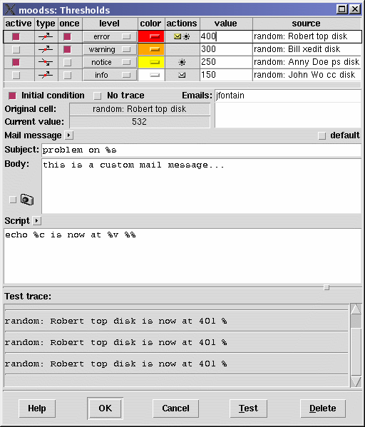
A list of threshold entries is displayed in a table with the following columns:
 ) is displayed when there is at least one email recipient specified in the list of email addresses (see below), with a yellow tint (
 ) when the mail message is not the default (see below), and a small gear icon (
 ) is displayed when the threshold script (see below) is not empty.
Additionally, when a row is selected, the following fields become available in the lower area of the dialog box:
Sample threshold email message (the default):
From: moomps@localhost.localdomain
To: jfontain@localhost.localdomain
Subject: moodss threshold warning message

warning: "random: Robert top disk" data value is now "11",
which triggered the "up" threshold of "10".
Selecting a row is done by clicking on any cell of the row. The row is then highlighted.
When selecting another row in the thresholds table, or closing the dialog box using the OK button, the syntax of the displayed emails is checked and errors, if any, reported in a message box. It is then recommended to test that emails actually get sent and to the right recipients, using the test functionality described below.
Help is provided through widget tips on the table title cells, and a help button, which directly opens the main help window at the relevant section.
Creating threshold entries is done through the drag'n'drop mechanism by dropping data cells into the thresholds drop icon or into the thresholds dialog box table itself (provided it is open, of course). Any number of thresholds can be set on the same data cell.
The following threshold types are supported:
 : threshold and cell value must differ.
 : cell value must be less than threshold.
 : threshold and cell value must be equal.
 : cell value must be unknown (void).
 : cell value must be more than threshold.
Depending on the source data cell type, specific internal comparison techniques are used.
For the ASCII type, the current cell value can be lexicographically less than, equal to, or greater than the threshold value. Empty threshold values are allowed. The strings are compared in a case-insensitive manner.
The dictionary type is handled as the ASCII type, with case ignored except as a tie-breaker and if there are embedded numbers, the numbers compare as integers, not characters.
For the clock type, the cell and threshold values are first converted to seconds, then compared.
When the threshold type is , the condition occurs when the data cell value cannot be determined, and only in such a case. It is the only type of threshold that can be triggered by the void nature of a data cell.
This condition can happen when a data cell (of any type) no longer exists (for example, when its row has disappeared), or the data cell is of numeric type, still exists but contains void data (displayed as ?).
For other types of data cells, the displayed value when the data cell becomes void should be documented in the module help, and setting a threshold on such a cell being void should instead be done using the equal () threshold type on the specified value.
Note that for each type, you may choose for the thresholds actions to be taken only once by checking the once column.
If a non-transparent color has been selected (see previous section), whenever the threshold condition occurs, all displays of the monitored data cell change color (in data tables or in viewers), and return to their normal color when the threshold condition no longer exists.
When several thresholds are placed on the same data cell with different colors, and they all trigger, the behavior is undefined at this time (but the most recent threshold is likely to prevail).
Whenever a threshold is triggered (the manner of which depends on the type), the corresponding script is passed to the UNIX shell interpreter (the sh UNIX command), after variable substitution.
Substitution occurs prior to script invocation if the script contains any % characters. Each % and the character following it is replaced with information from the threshold occurrence. The replacement depends on the character following the %, as defined in the following list:
Any error returned by the script is visible in the trace module.
When a row is selected, it is possible to drag from the current cell value display, into the thresholds table itself to create a new entry for the same cell, or into any viewer icon or existing viewer.
When the dialog box is displayed, existing thresholds are sorted according to their importance level with the most important on top. If several thresholds of the same type and same importance level are set on the same cell, the highest (according to the cell data type) threshold is displayed first.
When new thresholds are interactively added to the dialog box, they are displayed at the bottom of the thresholds table, but will be sorted as the others the next time the dialog box is opened.
While the thresholds dialog box is visible, threshold conditions are not checked by the software, which means no cell color changes, no email alerts, ... can occur.
Internally, threshold conditions are checked in reverse order compared to the displayed order, that is the most important thresholds last. As a consequence, color gradients on a cell are automatically achieved.
For example, if you set the 3 following up thresholds of the same importance level (does not matter in this case, say info) on the same cell:
you will get a color gradient effect, as the cell value approaches 100, it will turn yellow, orange then red.
You can also force color gradients on a cell by combining importance levels and colors.
For example, if you set the 3 following up thresholds on the same cell:
you will get an importance color gradient effect as the cell value approaches 100.
If the threshold condition is met most of the time, such as an initial condition, you can disable acting at application start by checking the initial condition button (see example in notes).
The initial condition button, when checked, prevents any action from being taken when the application (moodss or moomps) is started.
It is useful when the threshold condition is "normal". For example, when monitoring a network link, you want to be warned when it goes down (for example by checking that the ifOperStatus is down using the snmp module), but you also need the information that the link is back up (by checking that the ifOperStatus is up). Unfortunately, using this technique, you would get an email stating that the link is up every time the application is started. Checking the initial condition button prevents it.
There are still a lot of features to implement: please see the TODO file.
Opens the thresholds dialog box, but displays only the thresholds defined on the data cells present on the current page.
Note that while the thresholds dialog box is open, you still may switch to another page and drop its data cells into it.
When selected, this menu launches the dashboard configuration dialog box, as described in Configuration.
Creates a new page after the existing pages. If there are no pages, that is all modules are displayed in the sole main window canvas, those contents are placed in the first page just created. The page is then displayed, its tab opened in editing mode so the label can be immediately set by the user.
To delete a page, just grab its tab and drop it in the eraser drop site. Note that a page must be empty of any table of viewer before it can be deleted, except for the last remaining page, the deletion of which results in only its tab being removed.
Allows the creation of empty viewers of any type (graph chart, stacked graph chart, overlap bar chart, side bar chart, stacked bar chart, 2D pie chart, 3D pie chart, statistics table, values table, free text, iconic and formulas tables).
This menu is only visible when not running in read-only mode (see Command line).
Opens the database dialog box, a drop site for modules data cells. The cells dropped in the database dialog box will be monitored by moodss (see the Database Start menu) or the moomps daemon (provided of course that the configuration file (see Save menu) is used by the moomps service).
The dialog box displays a table, the drop site, with the following columns:
When the moomps service is running, any number of data cells can be monitored over time, using a SQL database as storage mean. The cells values are stored in the database, which can then be used from, for example, a spreadsheet software. Using such tools, it becomes possible, for example, to create history graphs, presentations, ... using the moodss database as data source. (more information can be found in the moomps documentation).
For example, if you want to monitor CPU usage over time on a Linux server, load the cpustats module, open the database dialog box, drag and drop the user, system and nice cells in the database interface and finally save the configuration in a .moo file within the moomps configuration directory.
Note that only cells coming from an original module table can be dropped in the database window. If you attempt to drop a cell from say a statistics table, the cell will not appear in the database window and an error message will be displayed in the main application window message area.
When selected, this menu launches the preferences dialog box, as described in Preferences.
The format used for saving the preferences is XML, as the following preferences file extract shows:
<?xml version='1.0'?> <!DOCTYPE moodssPreferences> <moodssPreferences> <version>16.8</version> <date>12/26/02</date> <time>21:29:31</time> <traceNumberOfRows>20</traceNumberOfRows> <printToFile>0</printToFile> ... |
On UNIX platforms, the preferences file is named .moodssrc and is saved in the current user home directory, with write and read rights strictly restricted to the current user, as sensitive information, such as database passwords, can be stored in the preferences file.
(not available on Windows platforms)
Use this menu to create a new predictor tool, which looks and behaves like a graph viewer at first. It is available in database mode only and accepts the drop of one data cell only.
This tool requires a statistical computation engine and can load data samples for training and experimentation (see predictor preferences).
The predictor tool allows predicting data behavior in the future, based on the past history, recorded in the database, of a data cell. Using this tool requires some training and the study of its specific documentation.
Immediately refreshes display of all loaded asynchronous modules.
The View menu (may not exist, see below) contains the Poll Time entry which when selected launches the corresponding dialog box, as shown below:

The user can select a new poll time among the module choices from a spin entry widget, or directly type in a new value, as long as it is not smaller than the module minimum poll time, in which case a warning message is displayed.
When several modules are used, the minimum poll time is the greater of the minimum poll times of all modules. The default poll time (used when moodss is started) is the greater of the default poll times of all modules. The available choices in the poll time dialog box is the combination of all modules poll times.
The Poll time menu entry is available only when needed, which is not the case if all the loaded modules are asynchronous. If this case, the Options menu itself is not displayed.
This menu is only visible when not running in read-only mode (see Command line).
Allows the specification of precise date and time limits for database views, loaded using the File Database Load menu.

Note that once you have validated your choice (using either the OK button or the Apply button, the latter keeping the dialog box opened), the dialog box closes and all database related views are automatically refreshed (it is not necessary to manually use the refresh view menu or button).
Also note that the blue cursors in the database module instances viewer are updated in real-time as the values in the dialog box are changed.
Allows finding and bringing up to front a table or a viewer within the current dashboard. For example, one could select the graph viewer from the second page, which would become immediately visible.
When there are no pages, module tables and viewers are listed as simple menu entries, such as cpustats for the cpustats module table, graph viewer, 3D pie chart, ...
If the current dashboard includes several pages, each page appear as a sub-menu entry (cascade menu) featuring the tables and viewers that it contains as menu entries.
When selecting an iconified object, such as a module table, the object is restored to its original visible state before being shown to the user. In other words, found objects never stay iconified.
Opens a separate window containing the 20 latest informational, error, ... messages (if any) internally generated by the loaded modules. This menu entry when selected again closes the window.
A resident trace module is actually used to fill the contents of that window, which does not prevent loading other instances of the trace module in the main window, as can be done with any other module.
Shows or hides the tool bar.
This menu launches an embedded HTML viewer with this very document minus the sections related to module development.
This menu features one sub menu per module, which when selected displays the module's help data.
Displays version, author, extension authors, license and basic information about moodss.
This common user interface part makes some menu actions direct by using buttons with embedded icons. Help is provided through widget tips (balloons).

The contents of the tool bar change depending on whether a module is loaded, a save file has been used, ... and always fit to the current context. The tool bar can be hidden or displayed at the user convenience using the Tool bar menu.
The largest part of the main window is the canvas area, used to display and manage data tables, viewers and icons. Its background color can be changed in configuration and preferences. An internal window manager handles all the operations within the canvas.
All data viewers can be moved and possibly resized thanks to handling areas in the data viewer borders. When moving the mouse pointer over these areas, the mouse cursor changes to indicate the possible action. Corner handles allow resizing in both X and Y axis. Handles in the middle of the sides allow resizing in either the X or Y axis direction. All other areas can be used for moving the data viewer as shown by the quadruple arrow cursor.
For tables and viewers with borders, clicking on any part of the border changes the stacking order: the viewer being clicked on either goes below (possibly becomes hidden) the other viewers, or becomes fully visible (on top, possibly hiding other viewers). If you want to avoid moving the viewer while attempting to change its stacking order, you may use the second mouse button (in the middle on a 3 button mouse) instead of the first mouse button.
Iconic viewers and minimized tables (displayed as icons) can only be moved, and, due to the internal implementation, can be hidden by other viewers. However, they still can be detected by circulating between the viewers as described below.
You can circulate between tables, icons and viewers by using the Tab (forward) and Shift-Tab (backward) keystrokes, which successively bring the next object to the top in the stacking order, in the case of tables and viewers with borders. Minimized tables (icons) and iconic viewers are highlighted for a short time using a black border, which shows even if the object is hidden by other viewers.
When moving or resizing a table or a viewer, its window or its borders will snap, as if attracted by a magnet, when getting close to another window or the canvas borders. This makes aligning a large number of windows convenient (note: this feature was designed by somewhat copying the KDE window manager behavior).
Note: for more precise placement, it is possible to disable the magnet effect by holding down the Control key while moving or resizing objects.
When moving or resizing, the message area displays the current coordinates or size in real time as the mouse is being moved.
Further description of this small window manager functionality is useless, as it behaves like a basic window manager (let me know if it does not).
Module tables can be minimized by clicking on the down arrow button of the right side of a table title area. The resulting icons are arranged at the bottom left of the canvas area, from left to right. Icons can be moved simply by clicking and holding the left mouse button. Double clicking on an icon results in the corresponding table to become visible again at its original position.
Once moved by the user, a table icon icon will remember its coordinates. That is if the table is restored then minimized again, the icon will be placed at its latest position.
Pages, also known as tabs, are a way to split a dashboard into several areas or categories of monitored elements. Pages can contain any number and types of elements: data tables, viewers, ...
If there are several pages displayed (see New page menu for creating pages), the pages tabs are visible near the bottom of the main window (by default, but the tabs can also be placed on top using the pages section in preferences).
A page tab label can be changed at any time while the application is running. Click with the third mouse button on the chosen tab, the text background then changes and the insertion cursor is displayed. Note that the whole text is initially selected to make it easy to replace the label by immediately typing. Once done, press the Return key to confirm or the Escape key to abort editing the tab label, in which case it returns to its previous value.
Viewers and tables can easily be moved across pages by using the internal window manager. Move the table or viewer as you normally would but keep going into the destination page tab until the black drop border appears around the tab label, then drop. The table or viewer is placed at the upper left corner of the destination page.

If a page contains any table or viewer containing data cells with active thresholds, then the page tab background takes the color of the most important threshold (according to its importance level). If there are several active thresholds of the same most important level, but with different colors, then the colors are shown in sequence, 1 per second, as the page tab background.
Additionally, up to 3 of the most important threshold summaries are displayed in a widget tip (or balloon) when the mouse cursor lies over the page tab (see picture above).
The background color and image can be changed, using the menu that pops up when clicking on the page background with the third mouse button (also see configuration of dashboard background).
From the same popup menu, you may also edit the thresholds defined in the page (see page thresholds).
The message area header label also serves as a thresholds indicator, just like a page tab, but for all the thresholds activated in the application.
The behavior is identical to a page tab, with the most important thresholds colors displayed in sequence if necessary, and a widget tip showing the most important thresholds summaries.
At the bottom of the main window, the message area is used to display various help and information strings for the user. For example, every time that a module is updated, when a menu entry is being activated, or to instruct the user on how to edit a page tab.

Drag and drop in moodss tries to behave as in popular GUIs. For example, to create a graphical plot, one must first select one or more data cells in a data table, hold down the first mouse button (the left one for a right handed user) while dragging over to the left-most icon below the menu bar (when dragging an object, as the mouse pointer passes over possible drop sites, they are highlighted with a thin black border for user feedback). Releasing the mouse button at this time results in the creation of a BLT graph viewer.
Only valid drop sites for the data being dragged are highlighted when the mouse cursor passes over them, thus guaranteeing error free operations (if there are no bugs, that is :).
In summary, data cells can be dragged from any table or any viewer into any viewer drop site icon, any viewer or the eraser.
All icons right below the menu bar are valid drop sites for data cells (several may be dropped at the same time). From left to right:
For example, a graph viewer with 1 curve is created by dropping 1 data cell into the graph viewer icon.
Once a viewer exists, it also acts as a drop site for data cells, which may be dragged from any table or other viewers. Dropping one or more cells directly in the viewer results in corresponding lines, bars, slices or rows being created and automatically updated. Each new graphical element is assigned a new and different color.
You may delete one or more viewer elements (graph lines, bar chart bars, pie charts slices, statistics or values table rows or free text cell window) from a viewer by selecting them (using the first mouse button) through their labels. Several elements can be selected by depressing the control key as the first mouse button is pressed. The selection can also be extended by depressing the shift key along with the first mouse button. The pie slices can also be directly selected by clicking on the slices themselves.
Then dragging from the viewer to the eraser drop site (the pencil eraser) on the upper right side of the main window and releasing the first mouse button result in the corresponding viewer elements to be destroyed. When there are no remaining elements, the viewer itself (graph, bar chart, pie, values or statistics table) can be destroyed by dropping it into the eraser site. The free text viewer can only be deleted this way when completely emptied of any text and data cell window.
Any viewer can be deleted in one shot by dropping from the eraser icon into it.
Yet another way is to move the viewer (as usual, using the internal window manager handles) into the eraser.
Any viewer also acts as a drop site for viewer type data, which allows viewer mutation by just dropping from the new viewer type icon into the existing viewer. It is much quicker than destroying the existing viewer and create a new one of the new type, while remembering which data cells were monitored by the viewer of the old type.
When mutating, if some cells in the current viewer no longer exist (they may belong to a disappeared statistics table), they are not made a part of the new viewer, and a warning message is flashed to the user in the message area.
A page tab is a drop site for any table or viewer, which allows transferring them between pages. Proceed by moving the table or viewer (as usual, using the internal window manager handles) into another page tab (wait until you see the drop black outline around the tab label to release the mouse button). The viewer can then be found in the upper left corner of the target page.
A formulas table is a drop site for any formula, coming from other formulas tables.
A table is obviously a drag site. One or more cells can be dragged at once after selection, using the traditional single/shift/control mouse click technique.
Any viewer is also a drag site. It requires selecting one or more viewer elements before initiating the drag operation from any selected element in the viewer. If there are no selected elements, dragging is impossible: the mouse cursor is not changed into the drag circular cursor.
If a viewer contains no elements, then the viewer itself can be dragged and dropped into the eraser.
All viewer icons (below the menu bar) are drag sites for viewer type data, which allows quick viewer mutation (see mechanism description in Drop sites).
Note that formulas tables are special kinds of viewers, as they also allow copying formulas: dragging a data cell in another formulas table results in the formula being copied (dropped) in the other formulas table.
The eraser icon is also a drag site of the killing action type, which allows viewer destruction in one shot.
A viewer or a table is also a drag site when being moved via its window manager handles:
Moodss supports localization of the user interface for the following languages:
Support for international languages has only been tested on Linux so far, but should work well in other environments.
All that is needed is checking that the proper environment variable is set. For example, for a French GUI:
$ echo $LC_ALL fr |
$ echo $LANG fr |
Except for the random module, which supports Japanese, all the help for modules is available in English only.
Note: if you need support for other languages, please contact me.
Launching moodss is very simple:
$ moodss |
or
$ wish moodss |
if the Tcl/Tk wish interpreter is not found in your PATH. You can then dynamically load modules from the File menu.
You can also just pass one or more data module names as parameters, as in:
$ wish moodss random |
or, for 2 modules at once:
$ wish moodss ps cpustats |
You can specify the same module more than once and with different arguments in the command line:
$ wish moodss ps -r host.domain ps -r otherhost.domain |
When several modules of the same type are passed as argument, the initial data tables feature the module name followed by a number as title. For example "ps<2>". If the module provides an identifier string, that text will be used instead, as in "ps(host.domain)". Data cell labels include the module identifier or numbered module name as well, for proper identification.
You may optionally specify a poll time in seconds using:
$ wish moodss -p 25 random |
Note that when all the specified modules are asynchronous, the poll time option specifies the preferred interval for graph viewers.
Once saved through the File Save menus (for example in dashboard.moo), the dashboard can be retrieved and loaded using:
$ wish moodss -f save.moo |
which would result in the same modules being loaded, the same viewers displayed at the same positions and sizes, the same poll time being used, as well at the same application window size. New modules data displays can be added at any latter time to existing dashboards by specifying modules on the command line after the -f (--file) switch / value pair.
Command line options include:
Moodss command line options must appear before any module name appears on the command line, so as not to interfere with the module options.
In debug mode, when errors occur within the module namespace body or initialize procedure, the error message (either in text output when loading the module from the command line, or in a message window when dynamically loading the module) is followed by a Tcl stack trace of what was in progress when the error occurred (see the Tcl error manual page for further information).
Module themselves can take options (if programmed to do so, see module initialization), through command line arguments placed right after the module name and before the next module name, if any.
For example, the following command:
$ moodss -p 15 random --asynchronous arp --remote jdoe@foo.bar --numeric route --numeric |
causes the random module to update asynchronously, the arp module to collect data from the foo.bar host under the jdoe login name and not attempt to lookup symbolic names for hosts, with the last module route doing the same.
Note the setting the application poll time to 15 seconds does not interfere with the module options.
The moodss core checks the validity of module options according to the information provided by the module programmer. Any invalid option / value combination for the module is detected, reported on the standard error channel before the application exits.
Finally, it is always possible to determine the valid options for a module, using the following command:
$ moodss module --help |
All configuration parameters of a dashboard can be set using the following interface:
The dashboard configuration dialog box allows the user to change global settings for the current dashboard. This data is stored along when saving the configuration to a dashboard file (see Save menu).
Changing configuration choices do not affect the Preferences choices, which are used as initial values the first time the user modifies the configuration. Configuration settings have a higher priority than preferences settings, but are lost when not saved in a dashboard.
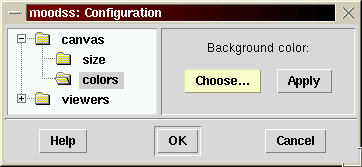
Configuration entry is done through pages organized in a browsable hierarchical tree, always visible on the left side of the configuration dialog box (see picture above).
After selection of the category from the tree on the left, a related dialog interface appears, which may or may not allow immediately applying new data values.
Clicking on the OK button results in the current configuration data to be saved in memory. It will be stored in the dashboard file when requested (see File Save and Save as menus).
Specific help can always be accessed by clicking on the bottom Help button when in a configuration page.
The canvas is the data viewers background area, and its configuration (size, color, ...) can be changed as described below.
The canvas width and height can be changed so that all the different tables and viewers that the dashboard comprises can fit nicely within the viewing space.
It is also possible to make the canvas size automatically scale as the main window is resized by the user. In this case, scrollbars are displayed only when necessary, so that all displayed objects (tables, viewers, ...) can always be reached.
The default is automatic scaling.
The size is immediately updated when clicking on the Apply button.
The dashboard background color can be changed, either globally or per page if there are any. Similarly, a background image can also be used as background, globally or per page.
Note: the only format supported at this time for background images is GIF (with transparency).
If the current dashboard includes pages, there are displayed in the right side of the configuration dialog box, with the current page selected (see screenshot above for an example).
When clicking of the Color button, a new dialog box opens, which allows the choice of a new color. If the image file option is selected, clicking the Choose button opens a file selector dialog box, where an image file can be picked. The image can either be centered in the display or placed at the top left corner.
Note: when the image is centered, its position is automatically updated every time the dashboard is resized.
The small display of the right side is a scaled-down view of the current application window. It gives an idea of the appearance of the display using selected background color, image and position.
The background color, image and position are immediately updated when clicking on the Apply button.
The viewers are used for viewing table data, and their configuration (colors, ...) can be changed as described below.
These are the colors of viewer elements. For each viewer that needs different colors for displaying data cell elements (such as graphs, pie charts, ...), each new element uses the next color in the sequence (wraps around if necessary).
Advice: adjacent colors should be very different, colors should be visible on a black background.
Note: in a future version, creating, deleting and moving colors in the sequence will be possible.
The number of samples (on the X axis) can be changed for data graph viewers. The more samples, the wider the X axis and thus the longer the visible data time span.
By default, the Y axis scales automatically with its minimum and maximum values set to those of all plotted data points, for maximum precision. Optionally, a value of 0 can be fixed for the Y axis minimum.
It is also possible to set the angle of the X axis (date and time) labels (from the slanted 45 degrees to the default vertical 90 degrees).
The background color of the plot area can be chosen for all graph viewers in the dashboard, so that, for example, a printed version looks better (also see the colors configuration for setting the color choices for the displayed elements).
It is possible to display or hide a grid in the plot area for all graph viewers in the dashboard, state which can be independently overridden from the popup menu in a graph viewer.
Finally, the position of labels of data cells, in graph and bar chart viewers, can be set. This will be the default position for newly created viewers, although the position can be overridden per viewer from a popup menu. The available positions are right (the default), bottom, left and top, all relative to the graphical part of the viewer.
These settings can be immediately applied to existing graphs by clicking the Apply button.
The labeler type for data pie viewers can be changed as follows:
The selected type will not be used for existing pies but for newly created ones.
In database history mode, set the maximum number of displayed rows (see tables).
One can choose whether module names or identifiers are displayed in cell labels in viewers (such as graphs, pies, tables, ...).
For example, when there is only one module loaded, or several modules but with specific and easily recognizable data cell labels, it may not be necessary for data cell labels to be prefixed with the module name in viewers.
The preferences dialog box is used to set application-wide settings for the current user, and is also used to preset default configuration values for dashboards.
It is very similar to the dashboard configuration dialog box, except that it includes more categories.
The settings are saved in a global file (known as an rc file to UNIX people), used to initialize global configuration variables when the application is started. Since this file is stored in the user home directory (on a UNIX system), it provides a way for a user to customize the look, behavior, ... of the moodss application in a permanent manner.
Some preferences choices, when validated, are not immediately taken into account: the application needs to be restarted for changes to take effect.
Note: this is a new behavior since moodss version 18.4.
On UNIX systems, preferences data is saved in each user home directory under the rc file named .moodssrc.
On Windows, data is saved in C:\.moodssrc (by default, but depends on the HOME variable).
After selection of the category from the tree on the left, a related dialog interface appears on the right side of the dialog box.
Help is provided for each interface.
Clicking on the OK button results in the preferences data to be written to the rc file.
Sets the default size for dashboards (see configuration size section).
Sets the default background color for dashboards (also see configuration background section).
You can choose the font family and its size, to be used globally in the user interface, for menus, viewers, ... Every time another family or size is selected, the text area below the drop down menus is updated using the new font, so that the user can evaluate the change.
(not available on Windows platforms)
The canvas area can be printed in the Postscript data format.
The default behavior when printing can be set to either a printer or a file, but can always be overridden in the print dialog box launched when actually printing.
Various parameters, such as orientation, palette and paper size can be set.
The print command typically reads the Postscript data from its standard input and redirects it to the specified printer (for example, on UNIX, 'lpr -Pacme' will print the canvas area on the "acme" printer.
By default, the command is set to 'lpr -P%P', which by including the %P generic printer name tag allows the user to pick the printer from a list (drawn from the /etc/printcap database) at printing time.
When printing to a file, you may choose its default location and name with the file browser. Note that it can be overridden in the print dialog box launched when actually printing.
When pages are used (see New page menu), the user can choose whether the pages tabs are positioned on the top or the bottom side of the pages.
If you want the moodss application or the moomps daemon to record data cell values in a history database, set the following options:
Note that no changes are allowed if there is a current connection to the database (storing some data cells history). Also the moomps daemon, if running, must be restarted to take any change into account (also see its configuration).
Whenever a loaded module signals a problem or has some information to communicate to the user, the trace window can be automatically displayed (the default behavior), or displayed on demand using the view menu. Choose the behavior using the automatic display check button.
The number of rows in the trace window can be set (it is 20 by default).
Note: the new value will not be taken into account immediately but the next time the application is started.
(not available on Windows platforms)
Statistics calculations are performed by the R program (www.r-project.org), which must be installed for the predictor tool to work. Enter the R program path or simply R if its directory is already in your search path for commands (see the PATH environment variable).
Note: you must clear the path (or leave it blank) if you do not plan to use the predictor tool or have not yet installed R.
A powerful computing environment is needed to perform statistical computations: a 1 GHz processor with 512 megabytes of memory is a minimum and a multi-processor 2 GHz machine with 1 gigabytes of memory usable (the more processors the better).
The predictor tool can use multiple concurrent processes to reduce the time needed to find the best statistical model for the analyzed data. Set the maximum number of processes to the number of processors in your system, or less, if you would like to keep some processing power for other tasks. Note that the processes launched by the predictor tool have a "nice" priority, that is a lower priority than most of the other processes in your system, in order not to put too big a strain on your machine (see the nice UNIX command manual page for more information).
For example, increasing the number of processes from 1 to 2 on a bi-core processor machine will result in the model fitting calculations to take half the time.
When learning to use the predictor tool, make sure to make the sample time series available in the database instances dialog box. These datasets are not really made part of your database but provided by the moodss application itself. They come from the R project distribution and are great for training.
Note: use the predictor tool documentation for further information on the predictor tool and statistics.
Sets the default configuration for viewers (see configuration viewers section).
See configuration colors section.
See configuration graphs section.
See configuration pies section.
See configuration tables section.
See configuration cells section.
When a threshold event occurs, an email alert message can be sent (see thresholds).
Proper identification is required so that the originator of the message (the From address field in an email message) is known. Use your own email address or another email address (such as moodss@your.domain.com) that you control.
In any case, the From address field must contain a valid email address.
Your user name is used by default.
When closing the dialog box or moving to another section, the syntax of the email address is checked and errors, if any, reported in a message box.
Sending email requires at least one Outgoing mail SMTP server. Input the one that you use for sending your emails (check your browser or email software current configuration), or any other valid SMTP address (consult your system administrator in case of doubt).
You may enter additional servers that will be used as backups of the main server in case it fails. Keep pressing the <Enter> key to append servers to the list. To remove a server from the list, simply empty its list cell using the usual editing keys.
The local host (127.0.0.1 address) is used by default as the main SMTP server.
The mail message is built with a default subject and body, used for all thresholds for which the message has not been customized (see thresholds dialog box). The subject line and body text can include % substitutions, as described in the thresholds script section.
Depressing the default button restores the subject and body to their application hard coded default.
When a threshold condition occurs, a summary is sent to the trace module (visible via its window if it is displayed or by its table(s) if it is loaded as a module). This is the behavior by default, which can be turned off from this preferences page.
(only available on UNIX platforms)
The moomps daemon preferences file location can be changed from the /etc/moomps/rc default value. You must have write rights to the chosen file and its directory, as determined for the current user (generally root as traditionally used for configuring daemons). Error messages are appropriately displayed when this is not the case.
When the preferences are validated, all moomps relevant data will be written to the chosen file in XML format. You may enter no file name by clearing the textual entry space.
The daemon preferences file is saved with write and read rights strictly restricted to the current user, as sensitive information, such as database passwords, can be stored in it.
Please look at the TODO file (at least present in the source distribution).
I welcome any suggestion for new features that you may need in your specific use of moodss.
Bugs, questions, patches, ... should be reported using the SourceForge interface to the moodss project, at sourceforge.net/projects/moodss. This is the most efficient way to get your request processed, tracked, recorded, and made available to other moodss users.
Alternately, you may post requests on the comp.lang.tcl newsgroup or email jfontain@free.fr.
For downloading Tcl software (such as stooop, scwoop, tkpiechart, ...), many Red Hat rpm packages, visit my home page at jfontain.free.fr.
You may also find more information, such as reviews, links, examples, ... in the moodss (moodss.sourceforge.net) and MySQL (jfontain.free.fr/mysql) pages.